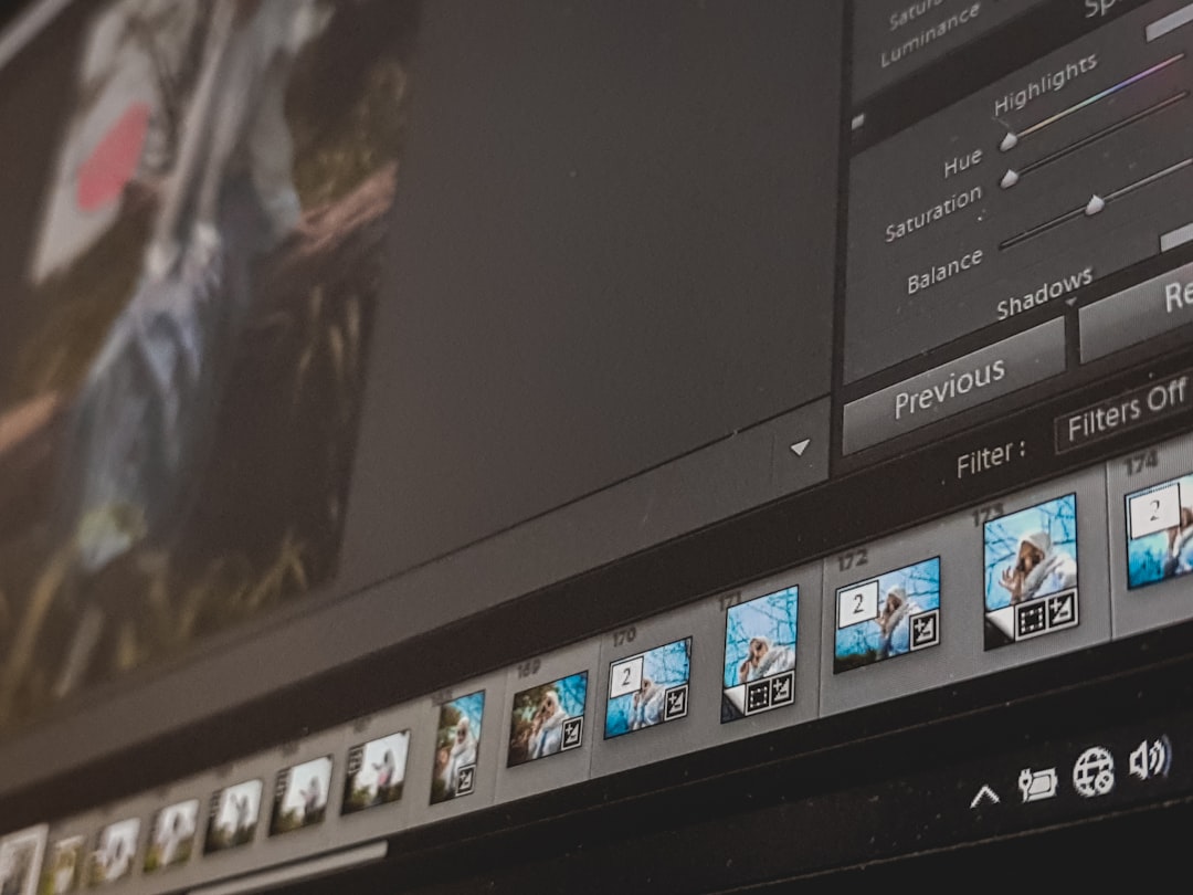
Title: Mastering Image Resizing: The Complete Guide to Perfectly Scaled Pictures for Web, Print, and Social Media
—
Introduction – Why Image Resizing Is the Unsung Hero of Digital Success
Picture this: you’ve just snapped a stunning photo of a sunrise, designed a sleek banner for your new product, or uploaded a high‑resolution logo to your website. The image looks flawless on your screen, but once it goes live, the page loads painfully slow, the layout breaks, or the file size blows past your hosting limits.
If this scenario feels familiar, you’ve already met the most common, yet often overlooked, challenge in digital publishing – image resizing.
Resizing isn’t just about shrinking a picture to make it fit a box. It’s a strategic step that impacts page speed, SEO rankings, user experience, and even conversion rates. Whether you’re a blogger, e‑commerce store owner, graphic designer, or social‑media manager, mastering the art and science of image resizing can save you time, money, and headaches.
In this 2,000‑word deep dive, we’ll explore everything you need to know: the fundamentals of image dimensions, the best tools for lossless and lossy resizing, how to automate the workflow, and the SEO tricks that turn a simple picture into a traffic‑magnet. Let’s unlock the power of perfectly sized images—one pixel at a time.
—
1. Understanding the Core Concepts of Image Resizing
1.1 Pixels, DPI, and Aspect Ratio – The Building Blocks
Before you click “Resize,” it helps to know what you’re actually changing:
| Term | What It Means | Why It Matters |
|——|—————|—————-|
| Pixels | The smallest unit of a digital image (e.g., 1920 × 1080). | Determines the visual detail you see on screens. |
| DPI (Dots Per Inch) | Measurement of print density; 300 DPI is standard for high‑quality print. | Affects print sharpness but not on‑screen display. |
| Aspect Ratio | The width‑to‑height proportion (e.g., 16:9, 4:3, 1:1). | Keeps images from looking stretched or squashed. |
Actionable tip: Always note the original aspect ratio before resizing. If you need a square thumbnail (1:1) from a landscape photo, crop first, then resize—otherwise you’ll end up with a distorted image.
1.2 Lossless vs. Lossy Resizing
- Lossless resizing keeps every original pixel intact (think PNG or TIFF). Ideal for logos, icons, and images that need to retain crisp edges.
- Lossy resizing discards some data to reduce file size (common with JPEG). Perfect for photographs where a slight reduction in detail isn’t noticeable.
- Web graphics, UI elements, and transparent images → lossless (PNG, SVG).
- Full‑color photos on blogs, e‑commerce product shots → lossy (JPEG) with smart compression.
- When you need a fast, no‑install solution for a handful of images.
- When you want to convert to modern formats like WebP without fiddling with command‑line tools.
- Snapseed (iOS/Android) – Precise crop & resize, export at custom dimensions.
- Resize Me! (Android) – Batch resizing with DPI control.
- Image Size (iOS) – Simple UI, supports PNG, JPEG, and TIFF.
- Standard print DPI: 300 DPI for high‑quality brochures, 150 DPI for large banners viewed from a distance.
- Example: An 1800 px wide image at 300 DPI prints at 6 inches wide (1800 ÷ 300 = 6).
- Set the correct DPI in your editing software before resizing.
- Convert to CMYK if the printer requires it (RGB → CMYK can shift colors).
- Export as PDF/X‑1a or high‑quality TIFF for the safest results.
- Cloudinary – URL‑based transformations (`https://res.cloudinary.com/demo/image/upload/w800,climit/q_auto/photo.jpg`).
- Imgix – Real‑time resizing, format conversion, and automatic DPR (device‑pixel‑ratio) handling.
- Firebase Storage + Cloud Functions – Custom serverless resizing pipeline.
- No need to store multiple versions locally.
- Instant global delivery via edge servers.
- Built‑in WebP/AVIF fallback handling.
When to use which?
1.3 The Hidden Cost of “One‑Size‑Fits‑All”
Many creators simply upload the original high‑resolution file and rely on the browser to scale it down. This practice inflates page weight, slows loading times, and harms Core Web Vitals—a key ranking factor for Google.
Bottom line: Always serve an image that matches the display size and the device’s pixel density (e.g., 1×, 2×, 3× for Retina displays). This is the foundation for responsive image techniques like `srcset` and `picture` elements.
—
2. Choosing the Right Toolset – From Free Apps to Pro‑Level Software
2.1 Desktop Powerhouses
| Tool | Platform | Best For | Key Features |
|——|———-|———-|————–|
| Adobe Photoshop | Windows/macOS | Professional editing & batch processing | Content‑aware scaling, “Save for Web (Legacy)”, scripts |
| Affinity Photo | Windows/macOS | Cost‑effective Photoshop alternative | Non‑destructive resizing, batch export |
| GIMP | Windows/macOS/Linux | Free, open‑source | Layer‑based scaling, plug‑in support |
| ImageMagick (CLI) | Windows/macOS/Linux | Automation & server‑side processing | Command‑line batch resizing, format conversion |
Pro tip: If you need to resize thousands of images on a regular basis (e.g., a product catalog), set up a script with ImageMagick. A one‑liner like `magick mogrify -resize 800×800 -quality 85 *.jpg` can shrink an entire folder in seconds.
2.2 Online Resizers – Quick Fixes for Non‑Designers
| Service | Free/Paid | Notable Feature |
|———|———–|—————–|
| TinyPNG / TinyJPG | Free (limited) / Paid | Smart lossy compression, bulk upload (up to 20 images) |
| Kraken.io | Free (basic) / Pro | API integration, WebP conversion |
| BulkResizePhotos | Free | No upload to server (client‑side), drag‑and‑drop batch resizing |
| Canva | Free (basic) / Pro | Template‑based resizing for social media, auto‑export to multiple sizes |
When to use online tools?
2.3 Mobile Apps – Resize on the Go
Real‑world scenario: A field photographer can capture RAW files, then use Snapseed to export a web‑ready JPEG at 1200 px width before uploading to the CMS—saving bandwidth and storage instantly.
—
3. Best Practices for Resizing Images for Different Platforms
3.1 Web & Blog Publishing
| Platform | Recommended Max Width | Recommended Format | Typical File Size Goal |
|———-|———————-|——————–|————————|
| General website | 1200–1600 px | JPEG (progressive) or WebP | ≤ 150 KB |
| Hero banner | 1920–2560 px | JPEG (high quality) or WebP | ≤ 300 KB |
| Thumbnails / Cards | 300–400 px | JPEG or PNG (if transparent) | ≤ 50 KB |
| Retina displays (2×) | Double the CSS width | WebP/AVIF preferred | ≤ 200 KB |
Action steps:
1. Resize to the exact CSS width (e.g., if your blog’s content area is 800 px, generate an 800 px version).
2. Export as progressive JPEG—browsers display a low‑quality preview while the rest loads, improving perceived speed.
3. Add `srcset` to serve 1× and 2× images:
“`html
<img src="photo-800.jpg"
srcset=”photo-800.jpg 1x, photo-1600.jpg 2x”
alt=”Sunrise over the mountains”>
“`
3.2 E‑Commerce Product Images
E‑commerce sites rely on crisp product photos to convert visitors. Here’s a proven sizing hierarchy:
| Image Type | Dimensions | Format | Compression Tips |
|————|————|——–|——————-|
| Primary product | 1200 × 1200 px (square) | JPEG (85 % quality) | Use “Save for Web” and enable optimize |
| Zoom/Detail view | 2000 × 2000 px | JPEG or WebP | Keep quality at 80 % to maintain detail |
| Thumbnail (category) | 300 × 300 px | JPEG | Aggressive compression (70 %) is fine |
| Mobile carousel | 800 × 800 px | WebP | Serve via `picture` element for fallback |
Pro tip: Enable lazy loading (`loading=”lazy”`) on all product images. This defers off‑screen images until the user scrolls, dramatically cutting initial page weight.
3.3 Social Media – Each Platform Has Its Own “Pixel Bible”
| Platform | Ideal Size (px) | Aspect Ratio | Format |
|———-|—————-|————–|——–|
| Instagram Feed | 1080 × 1080 (square) | 1:1 | JPEG (80–85 % quality) |
| Instagram Stories | 1080 × 1920 (portrait) | 9:16 | JPEG/PNG |
| Facebook Shared Image | 1200 × 630 | 1.91:1 | JPEG |
| Twitter In‑Stream Photo | 1200 × 675 | 16:9 | JPEG |
| LinkedIn Article Banner | 744 × 400 | 1.86:1 | JPEG |
| Pinterest Pin | 1000 × 1500 (recommended) | 2:3 | JPEG or PNG |
Quick workflow:
1. Create a master file at the largest required dimension (e.g., 2000 × 3000 px for Pinterest).
2. Export multiple versions using Photoshop actions or an online batch tool.
3. Rename with platform tags (`myphotoIG.jpg`, `myphotoFB.jpg`) to avoid confusion.
3.4 Print & Offline Media
When your image will be printed, pixel dimensions translate directly into physical size via DPI:
“`
Print Width (inches) = Pixel Width ÷ DPI
“`
Actionable checklist for print:
—
4. Automating Image Resizing – Workflows for Speed and Consistency
4.1 Using ImageMagick for Server‑Side Resizing
If you run a WordPress site, a Shopify store, or a custom CMS, you can automate resizing on upload:
“`bash
magick input.jpg -resize 800 -quality 85 output_800.jpg
Generate 1x and 2x versions for srcset
magick input.jpg -resize 800 -quality 85 output_800.jpg
magick input.jpg -resize 1600 -quality 85 output_1600.jpg
“`
Integration tip: Hook the script into your upload pipeline (e.g., a PHP function that calls `exec()` after a file is saved). This guarantees every image meets your size policy without manual intervention.
4.2 WordPress Plugins that Do the Heavy Lifting
| Plugin | Features | Pros |
|——–|———-|——|
| Smush | Automatic compression, lazy load, WebP conversion | Easy UI, bulk “Smush” for existing media |
| EWWW Image Optimizer | Server‑side resizing, CDN support | Handles PNG, GIF, and SVG |
| ShortPixel | Lossy & lossless options, PDF compression | Great for high‑traffic sites, API for developers |
| Imagify | One‑click bulk optimization, WebP generation | Fast processing, integrates with WP Rocket |
Best practice: Pair a resizing plugin with a CDN (Content Delivery Network) that serves the appropriate image size based on the visitor’s device. This reduces latency and further improves SEO.
4.3 Cloud‑Based APIs for Dynamic Resizing
Why go cloud?
Implementation snippet (Cloudinary):
“`html
<img src="https://res.cloudinary.com/yourcloud/image/upload/w800,climit,q_auto/photo.jpg”
srcset=”https://res.cloudinary.com/yourcloud/image/upload/w800,climit,q_auto/photo.jpg 1x,
https://res.cloudinary.com/yourcloud/image/upload/w1600,climit,q_auto/photo.jpg 2x”
alt=”Mountain sunrise”>
“`
—
5. SEO and Performance – Turning Resized Images Into Ranking Assets
5.1 The SEO Benefits of Properly Resized Images
1. **Faster Page Load → Better Core Web



Leave a Reply