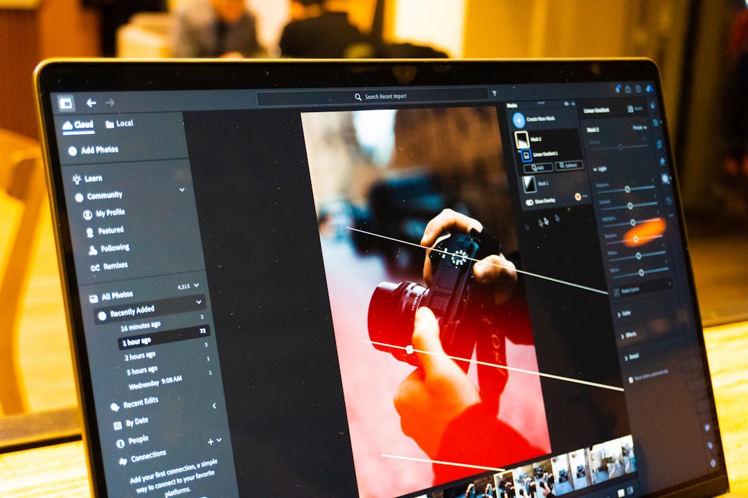
Title: Mastering Image Resizing: The Complete Guide to Faster, Sharper, and SEO‑Friendly Visuals
—
Introduction – Why “Size Matters” in the Digital Age
Ever scrolled through a website that seemed to load forever, only to discover that the culprit was a giant, uncompressed photograph? Or perhaps you’ve tried to upload a product picture to an e‑commerce platform, only to be met with an error that the file is “too large.” In both cases, the underlying problem is the same: image resizing.
Images are the visual backbone of any online experience— they grab attention, convey brand personality, and boost engagement. But if they’re the wrong size, they can sabotage page speed, drain mobile data, and hurt your SEO rankings.
In this 2,000‑word deep dive, you’ll learn why proper image dimensions matter, how to resize images without sacrificing quality, and which tools (both free and paid) can make the process painless. By the end, you’ll be equipped to create perfectly sized visuals for websites, social media, print, and beyond— all while keeping your site lightning‑fast and search‑engine friendly.
—
1. Understanding the Basics: Image Dimensions, File Size, and Aspect Ratio
1.1 Pixels vs. Inches – What Really Determines Size?
When we talk about “image size,” we’re usually referring to pixel dimensions (width × height). A 1920 × 1080 pixel image contains roughly 2 million pixels, regardless of whether it will be printed on a billboard or displayed on a smartphone screen.
In contrast, physical dimensions (inches or centimeters) matter only for print, where dots per inch (DPI) dictates how sharp the final product looks. For web use, DPI is largely irrelevant; browsers ignore it and render images based solely on pixel count.
1.2 File Size ≠ Image Dimensions
A common misconception is that a larger pixel count automatically means a bigger file. While resolution influences file size, the compression method (JPEG, PNG, WebP, AVIF) and compression level have a far greater impact.
- JPEG – lossy compression; great for photographs, but quality drops if you compress too aggressively.
- PNG – lossless; ideal for graphics with transparency, but files can be heavy.
- WebP & AVIF – modern formats offering superior compression with minimal quality loss; increasingly supported by browsers.
- Thumbnail – 150 × 150 px (grid view)
- Gallery – 800 × 800 px (zoomable)
- Hero – 1600 × 1600 px (full‑screen view)
- Standard brochure – 300 DPI at final size (e.g., 5 × 7 in)
- Billboard – 72–150 DPI at final size (viewed from distance)
1.3 Aspect Ratio: Keeping Your Image Proportional
The aspect ratio is the relationship between width and height (e.g., 16:9, 4:3, 1:1). Maintaining the original ratio during resizing prevents distortion. If you need a square thumbnail from a rectangular photo, you’ll either crop (cut off unwanted edges) or use “letterboxing” (adding blank space) to preserve the image’s integrity.
1.4 SEO Implications of Improper Resizing
Search engines consider page load time as a ranking factor. Oversized images inflate page weight, slowing down load times and hurting Core Web Vitals. Moreover, Google’s Image Search algorithm favors images that are appropriately sized for the displayed context, with clear `srcset` and `sizes` attributes. Proper resizing, combined with descriptive `alt` text, can boost visibility in both web and image search results.
—
2. When and Where to Resize: Use‑Case Scenarios
2.1 Websites & Blogs – The “Responsive” Rule
Modern sites must serve multiple device sizes. A good rule of thumb:
| Device Type | Max Width (px) | Recommended Format |
|————|—————-|——————–|
| Mobile (portrait) | 640 | WebP/JPEG (70‑80% quality) |
| Tablet (landscape) | 1024 | WebP/JPEG |
| Desktop (full‑width) | 1920 | WebP or AVIF (if supported) |
| Retina/High‑DPI screens | 2× device width | Same format, double pixel dimensions |
Using the HTML “ element or `srcset` attribute lets browsers automatically select the optimal size, but you still need to generate those variants in advance.
2.2 Social Media – Platform‑Specific Dimensions
Each platform has its own ideal image specs:
| Platform | Ideal Size (px) | Aspect Ratio | Notes |
|———-|—————-|————–|——-|
| Instagram Feed | 1080 × 1080 (square) | 1:1 | JPEG ≤ 10 MB |
| Instagram Stories | 1080 × 1920 | 9:16 | Vertical video thumbnail |
| Facebook Shared Image | 1200 × 630 | 1.91:1 | Use PNG for text‑heavy graphics |
| Twitter Card | 1200 × 675 | 16:9 | JPEG recommended |
| LinkedIn Post | 1200 × 627 | 1.91:1 | Keep under 5 MB |
Resizing to the exact dimensions avoids automatic compression by the platform, which can degrade quality.
2.3 E‑Commerce – Product Photos that Convert
Product pages often require multiple image sizes:
Consistent aspect ratios across product lines create a clean catalog look and reduce layout shifts, improving the Cumulative Layout Shift (CLS) metric.
2.4 Print & Marketing Materials – DPI Matters Again
When preparing files for brochures, flyers, or large‑format prints, you’ll shift focus from pixel dimensions to resolution:
In these cases, you’ll up‑scale images using specialized algorithms (e.g., Adobe Photoshop’s Preserve Details 2.0, Topaz Gigapixel AI) to avoid pixelation.
—
3. The Toolbox: How to Resize Images Efficiently
3.1 Desktop Software – Power and Precision
| Tool | Platform | Best For | Key Features |
|——|———-|———-|————–|
| Adobe Photoshop | Windows/macOS | Professionals | “Image Size” dialog with Preserve Details, batch actions, Export As WebP |
| GIMP | Windows/macOS/Linux | Free alternative | Scale Image, batch processing via scripts |
| Affinity Photo | Windows/macOS | Cost‑effective pro | Unlimited non‑destructive resizing |
| IrfanView | Windows | Quick batch jobs | Simple UI, supports dozens of formats |
| XnConvert | Windows/macOS/Linux | Bulk conversion | 500+ filters, custom presets |
Step‑by‑step Photoshop example
1. Open your image → `Image > Image Size`.
2. Uncheck “Resample” to view current DPI without changing pixel dimensions.
3. Check “Resample” and choose Preserve Details 2.0 for up‑scaling or Bicubic Sharper for down‑scaling.
4. Set the desired width (or height) and let Photoshop automatically adjust the other side.
5. Click OK, then `File > Export > Export As…` → choose WebP, set quality to 75 % (good balance).
3.2 Online Resizers – No Install Needed
| Service | Free Tier | Paid Tier | Notable Features |
|———|———–|———–|——————|
| TinyPNG / TinyJPG | 500 KB per image, 20 images/day | API access, larger files | Smart lossy compression, bulk (up to 20) |
| Squoosh (by Google) | Unlimited | Free | WebP/AVIF preview, lossless & lossy sliders |
| ResizeImage.net | Unlimited | N/A | Simple UI, crop + rotate |
| BulkResizePhotos | Unlimited | N/A | Drag‑and‑drop, batch, no server storage |
| ImageOptim (Mac app) | Free (open‑source) | N/A | Lossless + lossy, integrates with Automator |
How to use Squoosh for optimal WebP
1. Drag your JPEG/PNG onto the page.
2. In the right‑hand panel, select WebP → adjust “Quality” slider while watching the side‑by‑side preview.
3. Enable “Resize” → set max width (e.g., 1200 px).
4. Click Download.
3.3 Command‑Line Power Users – Automate at Scale
#### 3.3.1 ImageMagick
“`bash
magick input.jpg -resize 1200x -quality 80 output.jpg
Generate multiple sizes for srcset
for size in 480 768 1024 1440; do
magick input.jpg -resize ${size}x -quality 75 output_${size}.webp
done
“`
#### 3.3.2 Sharp (Node.js)
“`js
const sharp = require(‘sharp’);
sharp(‘input.png’)
.resize({ width: 1200 })
.webp({ quality: 80 })
.toFile(‘output.webp’);
“`
#### 3.3.3 Pillow (Python)
“`python
from PIL import Image
with Image.open(‘input.jpg’) as img:
img.thumbnail((1200, 1200), Image.LANCZOS)
img.save(‘output.webp’, ‘WEBP’, quality=80)
“`
These scripts can be incorporated into CI/CD pipelines, ensuring every new image uploaded to your CMS is automatically resized and optimized.
3.4 WordPress & CMS Plugins – Resize on Upload
| Plugin | CMS | Highlights |
|——–|—–|————|
| Smush | WordPress | Auto‑compress, lazy load, bulk optimizer |
| EWWW Image Optimizer | WordPress | WebP conversion, CDN integration |
| ShortPixel | WordPress | Lossless & lossy options, Cloudflare support |
| ImageKit | Headless CMS | Real‑time URL‑based resizing, edge CDN |
| Shopify Image Optimizer | Shopify | Automatic 2× retina images |
Most of these plugins intercept the upload process, generate multiple resolutions, and insert the appropriate `srcset` markup for you.
—
4. Best Practices & Common Pitfalls
4.1 Always Preserve the Original
Never overwrite the master file. Store the original in a “raw” folder (e.g., `assets/raw/`) and keep resized versions in a separate directory (`assets/optimized/`). This protects you from quality loss and lets you re‑generate assets if requirements change.
4.2 Choose the Right Compression Level
A quality setting of 70‑80 % for JPEG/WebP usually yields a visually indistinguishable result while cutting file size by 40‑60 %. Test by toggling the quality slider and comparing the “before/after” at 100 % zoom.
4.3 Leverage `srcset` and `sizes` for Responsiveness
“`html
<img src="photo-800.webp"
srcset=”photo-480.webp 480w,
photo-800.webp 800w,
photo-1200.webp 1200w”
sizes=”(max-width: 600px) 480px,
(max-width: 900px) 800px,
1200px”
alt=”Sunset over the mountains”>
“`
This markup tells browsers to pick the smallest file that still looks crisp on the user’s screen, saving bandwidth.
4.4 Avoid Upscaling Whenever Possible
Enlarging a low‑resolution image leads to blur and artifacts. If you need a larger version, locate a higher‑resolution source or consider recreating the graphic. Upscaling algorithms can help, but they’re a compromise.
4.5 Mind the Color Profile
Web images should use sRGB color space. Photoshop and other editors sometimes embed Adobe RGB or ProPhoto RGB, which can appear washed out in browsers. Convert to sRGB before exporting.
4.6 Test on Real Devices
Tools like Google PageSpeed Insights, Lighthouse, and WebPageTest highlight oversized images and suggest optimal dimensions. Use the “Opportunities” section to see exactly which assets need attention.
4.7 Automate with a Workflow
For teams that handle dozens of images daily, set up a simple automation:
1. Upload → a cloud folder (e.g., Google Drive, Dropbox).
2. Trigger → a Zapier/Make.com workflow that runs an ImageMagick script.
3. Store → resized files in a CDN bucket (e.g., Cloudflare R2, Amazon S3).
4. Publish → URLs automatically inserted into your CMS.
Automation removes human error and guarantees consistency.
—



Leave a Reply